


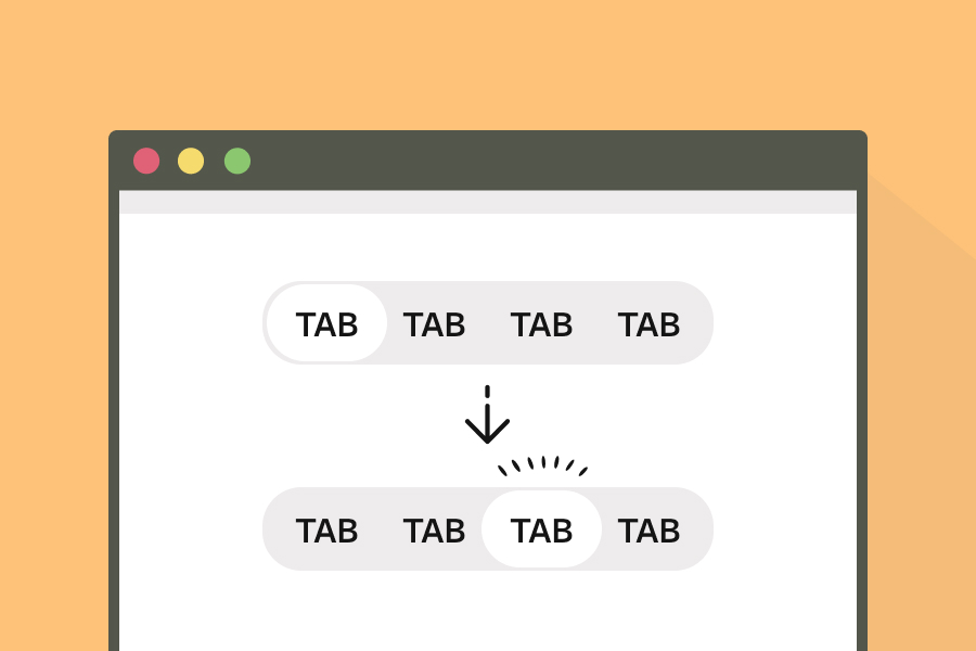
実装の考え方
マウスクリックで背景がぬるっと動くタブ切り替えボタンの実装方法を紹介します。アクティビティになった時の背景(tab__background)を、タブを並べている要素(tab__content)の中に入れposition: absoluteで置いておきます。
JavaScriptでタブをクリックした位置をタブのoffsetLeftで取得して、Web Animation APIでtranslateで移動させます。
scaleのY方向を途中の箇所で0.8に設定することで、ぬるっと動くように見えます。
実装方法
それでは実際に実装していきましょう。
まずはHTMLになります。
HTML
<div class="tab__content">
  <div class="tab__background"></div>
  <button class="tab__button">Day</button>
  <button class="tab__button">Week</button>
  <button class="tab__button">Month</button>
  <button class="tab__button">Year</button>
</div>
先述の通り、タブを並べる要素(tab__content)の中に移動する背景(tab__background)を入れます。タブはここではbuttonを使います。
CSS
.tab {
  &__content {
    --button-width: 5rem;
    --button-height: 3rem;
    --offset-width: 2px;
    --offset-height: 3px;
    position: relative;
    display: flex;
    align-items: center;
    height: var(--button-height);
    border-radius: calc(var(--button-height) / 2);
    background: #E5E7EB;
    box-shadow: 0 2px 4px rgba(0, 0, 0, 0.05);
    z-index: 1;
  }
  &__background {
    --background-width: calc(var(--button-width) - var(--offset-width) * 2);
    --background-height: calc(var(--button-height) - var(--offset-height) * 2);
    position: absolute;
    top: 50%;
    left: var(--offset-width);
    translate: 0 -50%;
    width: var(--background-width);
    height: var(--background-height);
    background: #FFF;
    border-radius: calc(var(--background-height) / 2);
    z-index: -1;
  }
  &__button {
    width: var(--button-width);
    cursor: pointer;
  }
}
ここでタブのサイズはカスタムプロパティの--button-widthと--button-heightで定義しておきます。移動する背景に関しては余白を設けるために下記のように計算しておき、leftの値もoffset分移動しておきます。
.tab {
  &__content {
    --button-width: 5rem;
    --button-height: 3rem;
    --offset-width: 2px;
    --offset-height: 3px;
  }
  &__background {
    --background-width: calc(var(--button-width) - var(--offset-width) * 2);
    --background-height: calc(var(--button-height) - var(--offset-height) * 2);
    width: var(--background-width);
    height: var(--background-height);
    left: var(--offset-width);
  }
}
また、背景が上にくると文字が見えなくなるのでz-indexで調整しておきましょう。
JavaScript
JavaScriptでアニメーションさせるために、Web Animation APIを利用します。
const tabBackground = document.querySelector('.tab__background');
const tabButtons = document.querySelectorAll('.tab__button');

const easeOutQuart = 'cubic-bezier(0.25, 1, 0.5, 1)';

const getTranslateX = (el) => {
  const transform = getComputedStyle(el).transform;
  if (transform === 'none') return 0;
  const matrix = new DOMMatrix(transform);
  return matrix.m41; // X方向のtranslate値
};

const tabClickAnimation = (bg, targetOffset) => {
  const currentX = getTranslateX(bg);

  bg.animate(
    [
      { transform: `translateX(${currentX}px) scaleY(1)` },
      { transform: `translateX(${(currentX + targetOffset) / 2}px) scaleY(0.8)` },
      { transform: `translateX(${targetOffset}px) scaleY(1)` },
    ],
    {
      duration: 600,
      easing: easeOutQuart,
      fill: 'forwards'
    }
  );
};

tabButtons.forEach(btn => {
  btn.addEventListener('click', () => {
    const offset = btn.offsetLeft;
    tabClickAnimation(tabBackground, offset);
  });
});
アニメーションを定義している関数がtabClickAnimationになります。
ここでcurrentXは背景色の現在の位置をgetTranslateX関数を新たに定義して取得するようにしてます。
getTranslateX関数は、getComputedStyle(el).transformで matrix(...)形式の transformを取得します。これをDOMMatrixに変換してm41を使えばtranslateXの値が得られます。これにより背景が「今どこにいるのか?」がわかるようになります。
取得したcurrentXとクリックしたタブの位置(targetOffset)を用いてアニメーションさせるコードが下記の部分です。
bg.animate(
  [
    { transform: `translateX(${currentX}px) scaleY(1)` },
    { transform: `translateX(${(currentX + targetOffset) / 2}px) scaleY(0.8)` },
    { transform: `translateX(${targetOffset}px) scaleY(1)` },
  ],
  {
    duration: 600,
    easing: easeOutQuart,
    fill: 'forwards'
  }
);
Web Animation APIでは、CSSのキーフレームアニメーションのようにアニメーションを定義することができます。ここでは、移動する位置の半分の箇所でscaleYの値を小さくすることでぬるっと動くようにしました。
以上になります。ぜひ試してみてください!